
Table of Contents:
The influence of color on emotion and mood is a captivating aspect of human perception that has intrigued artists, psychologists, and marketers for centuries. From the awe-inspiring palette of a sunset to the serene shades of a tranquil forest, colors have the extraordinary ability to evoke feelings and shape our psychological experiences. In this exploration, we delve into the intricate interplay between color and emotion, unveiling the captivating ways in which hues can impact our well-being and enhance our daily lives.
At the heart of the influence of color on emotion lies the fascinating realm of color psychology. Colors communicate with our brains at an astonishing speed, often triggering emotional responses even before we consciously process them. This phenomenon is deeply rooted in evolutionary biology, where colors served as vital signals for survival.
Colors are imbued with meanings and associations that are learned through cultural, personal, and societal contexts. These associations form the foundation of color psychology, where specific colors can evoke specific emotions and trigger unique psychological reactions. Understanding this intricate dance allows us to harness the power of colors to influence our mood and emotional state.
The color red is a symphony of emotions. It resonates with passion, intensity, and love. When we encounter red, our bodies experience a surge in adrenaline, quickening our heart rate and breathing. This physiological response mirrors the emotional intensity that red evokes. It’s no wonder that red is a favorite choice for romantic occasions, fiery expressions, and bold statements.
In marketing, red is a potent tool to create a sense of urgency. Clearance sales and limited-time offers often utilize red to instill a sense of excitement and encourage immediate action. The color’s ability to stimulate appetite has also made it a staple in the food industry, where fast-food chains use red hues to awaken the senses and drive hunger.
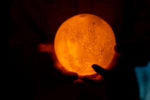
The color orange radiates with the warmth of a cozy embrace. It exudes optimism, encouraging feelings of happiness and enthusiasm. This lively hue is often associated with fun, playfulness, and adventure. Brands seeking to inspire a sense of warmth and approachability often incorporate orange into their communication.
Orange also sparks creativity and innovation. Its vibrant energy ignites the imagination and encourages a fresh perspective. Companies aiming to convey a sense of originality and inventiveness often embrace orange, signaling their commitment to pushing boundaries and thinking outside the box.
Yellow is the embodiment of sunshine and joy. It radiates positivity and evokes feelings of happiness and warmth. Just as the sun’s rays can brighten even the gloomiest of days, the presence of yellow can uplift our spirits and infuse us with a sense of positivity.
Beyond its emotional impact, yellow also stimulates mental activity. Research has shown that exposure to yellow can enhance cognitive processes, including memory and concentration. In educational settings or environments where creative thinking is prized, yellow can be a powerful ally, inspiring a sense of mental alertness and curiosity.
The color blue is akin to a tranquil oasis, instilling a sense of calmness and serenity. It’s often associated with the vastness of the sky and the calming embrace of water. Blue elicits feelings of trust and reliability, making it a popular choice for brands seeking to establish a sense of dependability and professionalism.
In healthcare and wellness industries, blue is a frequent guest. Its soothing effects create an atmosphere of tranquility, promoting a sense of comfort and emotional well-being. Hospitals and medical facilities often utilize shades of blue to alleviate anxiety and create a sense of reassurance in patients and visitors.
Green, the color of nature’s lush bounty, embodies harmony and growth. Just as plants thrive under the nurturing embrace of sunlight, our souls find solace in the calming influence of green. It’s a color that signifies balance and equilibrium, evoking a sense of stability and well-being.
Incorporating green into interior spaces can create a connection to nature, promoting relaxation and stress reduction. Offices and workspaces benefit from green’s calming influence, fostering an environment where creativity can flourish without the overwhelming pressures of stress.
Purple, a regal and enigmatic hue, is a potent vessel for conveying luxury and creativity. Its association with royalty dates back to ancient civilizations, where the rarity of the color made it a symbol of opulence. Even today, purple retains its aura of extravagance, making it an excellent choice for brands seeking to convey elegance and exclusivity.
Beyond its luxurious connotations, purple is also linked to creativity and spirituality. Its blend of calming blue and passionate red encourages a balance between introspection and inspiration. Artistic and spiritual communities often gravitate towards purple, harnessing its energies to delve into realms of imagination and higher consciousness.
Black, the embodiment of elegance and sophistication, carries an air of power and mystery. It is a color that commands attention, standing as a symbol of authority and strength. The sleek allure of black is often harnessed by luxury brands seeking to establish a sense of exclusivity and timeless appeal.
In design, black provides a canvas upon which other colors can shine. Its ability to create contrast and highlight details makes it an essential tool for creating visual hierarchy and depth. However, when overused, black can evoke feelings of heaviness and gloom, underscoring the importance of balance in color application.
White, the pristine canvas of possibility, signifies purity, simplicity, and clarity. Its association with innocence and cleanliness makes it a popular choice for weddings and religious ceremonies. The simplicity of white can evoke feelings of serenity and calm, creating a visual escape from the complexities of modern life.
In interior design, white serves as a versatile foundation. It can open up spaces, create an illusion of airiness, and provide a sense of tranquility. Brands aiming for a modern and minimalist image often embrace white to communicate simplicity and sophistication.
Gray, a neutral bridge between black and white, embodies balance, professionalism, and timelessness. It is a color that can seamlessly blend into various environments and adapt to different moods. Gray exudes a sense of reliability and composure, making it an excellent choice for business settings and corporate branding.
Gray’s versatility is showcased in its ability to complement and enhance other colors. It serves as a neutral backdrop that allows brighter hues to stand out, creating a harmonious visual experience. The perception of gray can vary based on its undertones; warmer grays evoke a sense of comfort, while cooler grays project modernity and sophistication.
Colors are not isolated entities; they exist within a rich tapestry of cultural symbolism. The meanings attributed to colors can vary dramatically across societies, often shaped by historical events, religious beliefs, and local traditions. For example, while red is associated with luck and celebration in Chinese culture, it may signify danger or caution in Western contexts.
The cultural significance of colors underscores the importance of understanding local perspectives and avoiding unintended misinterpretations. Brands operating in diverse global markets must navigate this intricate landscape to ensure their messaging resonates positively across cultures.
The influence of color on emotion isn’t a mere abstraction; it’s deeply rooted in the intricate workings of our brains. Different colors activate specific regions of the brain, triggering the release of neurotransmitters that impact our mood and well-being. The science of color psychology unveils the mechanisms behind our emotional responses to colors.
Colors affect our autonomic nervous system, which controls involuntary bodily functions such as heart rate and blood pressure. Warm colors like red can raise physiological arousal, while cool colors like blue induce a sense of relaxation. Understanding these neurological processes empowers individuals and businesses to harness color as a tool for intentional emotional impact.
The influence of color psychology extends beyond aesthetics, shaping the ambiance of our living spaces. In home decor and interior design, colors are like brushes on a canvas, painting the backdrop of our everyday experiences. Calming blues and greens can transform bedrooms into sanctuaries of rest, while vibrant yellows and oranges infuse kitchens with energy and warmth.
The colors we choose to wear become an extension of our personalities and emotions. They can alter our self-perception and even influence how others perceive us. Bright reds exude confidence and passion, while serene blues convey a sense of trustworthiness. By consciously selecting colors that align with our mood and intentions, we can amplify our emotional expression and create a harmonious connection between our inner world and outward appearance.
The impact of color psychology extends to the realm of productivity and well-being in the workplace. Companies are increasingly recognizing the importance of creating environments that promote focus, creativity, and collaboration. Cool and soothing colors like blue and green can foster a sense of calmness and concentration, enhancing productivity and reducing stress levels among employees.
Incorporating warm hues like orange and yellow in communal areas can stimulate social interactions and boost morale. Additionally, thoughtful color choices in office spaces can contribute to the overall sense of well-being, leading to happier and more engaged employees.
Color therapy, also known as chromotherapy, is a holistic healing practice that leverages the therapeutic properties of colors to restore balance and harmony to the body, mind, and spirit. Different colors are believed to resonate with specific energy centers (chakras) in the body, influencing physical and emotional well-being.
For instance, blue is often used to promote relaxation and reduce anxiety, while red is associated with increased energy and vitality. Color therapy is employed in various wellness practices, from spa treatments to meditation sessions, offering individuals a non-invasive and natural approach to enhancing their emotional and physical states.
As technology evolves, the study of color psychology expands into innovative realms. Artificial Intelligence (AI) is revolutionizing the way we understand color’s influence on emotion and mood. AI-driven algorithms can analyze vast datasets of color preferences and emotional responses, providing nuanced insights that can inform marketing strategies, design choices, and even mental health interventions.
Virtual reality (VR) and augmented reality (AR) experiences offer exciting avenues for exploring color’s impact on emotion. Immersive environments can simulate different color palettes, allowing users to interact with and observe their emotional reactions. As VR and AR technology becomes more accessible, the potential for personalized color-based experiences becomes increasingly intriguing.
The influence of color on emotion and mood is a mesmerizing dance between the visual and the visceral. Colors possess the remarkable ability to awaken dormant emotions, create harmonious environments, and elevate our well-being. As we navigate the labyrinthine corridors of color psychology, we unearth a treasure trove of insights that can enrich our lives in profound ways.
From the fiery passions ignited by red to the serene tranquility evoked by blue, colors have the power to tell stories without words, to heal without prescriptions, and to transform spaces into sanctuaries of emotion. By embracing the symphony of colors, we embark on a journey of self-discovery, connection, and empowerment—one where the canvas of our emotions is painted with the hues of the human experience.